Gilligraphic

This page explains how I responded to a business problem by designing templates to make a splash with target industries.

Summary
I spearheaded a new initiative to help improve Foleon’s value proposition. I designed industry-specific digital content templates that helped close over $150k in sales over the past several months, with over $300k in pipeline generated so far.
I designed these templates as a way to specialize our product offering towards our target industries.
Situation
I work for a SaaS company called Foleon, Foleon is a content creation platform that makes it easy for businesses to create engaging, interactive digital content.
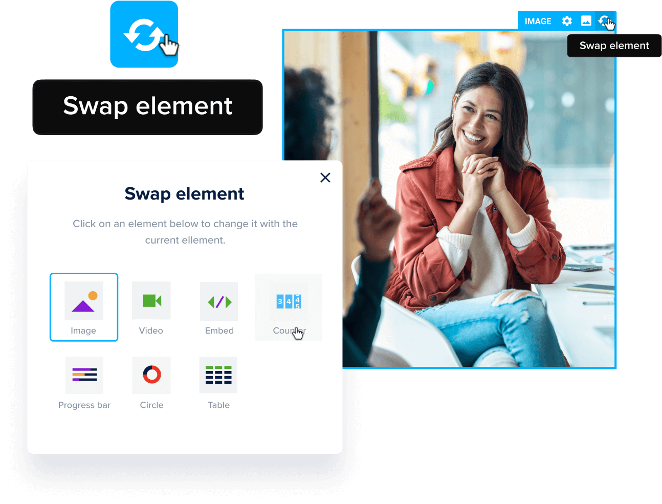
In our website builder, users build out pages using content sections called blocks. Our product has a set of black and white template blocks that were designed as a system to work well together for building digital publications. When designing content in Foleon, you can build from scratch, or use the black and white templates.


During our last company off-site, I had a chance to talk more closely with our sales team. A few of the account executives told me that prospects have been pinching their wallets tighter as a result of economic uncertainty and budget cuts. The AE’s at Foleon were desperate to find a way to further impress prospects by somehow improving our product offering.
I saw an opportunity to take our black and white templates a step further by creating industry specific use case templates. This new targeted approach allows customers to see a closer vision of how they can use Foleon to achieve their specific content goals.
My Approach
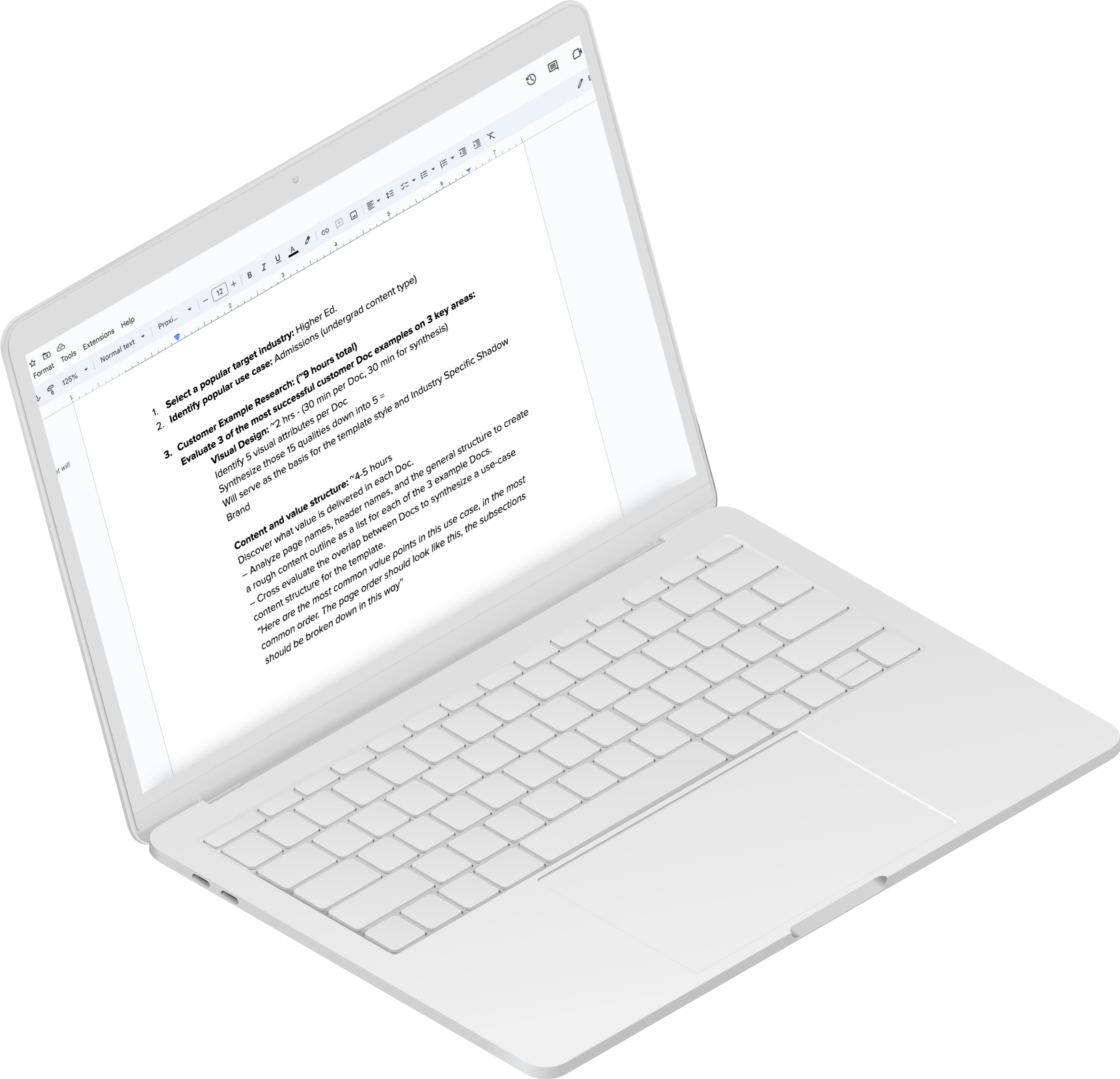
After deciding to create industry-specific templates, I analyzed the content overlap of the most successful customer examples for each specific content type. Successful examples are defined as ones which have been making the greatest impression with prospects. I also included relevant content examples which have won awards. I synthetized my findings in order to create content outlines for each specific template.


I worked with our product team in order to ensure that my new templates still adhere to the existing black and white template structure that we already have. There are certain layout, grid, and spacing considerations that I had to keep standard. This is to ensure that all of the template content can work cohesively when customers use my templates in conjunction with the existing black and white templates.
Overcoming Hurdles
At times, the product team and I didn't completely see eye-to-eye on when we should deviate from the old template's rules. However, this constructive discussion was incredibly useful, because it provided me with a greater understanding of the logic behind the existing template system. From the format settings, to the spacing, to the branding, there’s a rationale behind every decision in our black and white template system. While attempting to adhere to this system, I found it challenging to impress stakeholders while keeping the product team happy. Every decision I made had to be justified through qualitative customer insights in order to satisfy our product team. Luckily I’ve led hundreds of design consultation sessions and demos with our customers, there was no shortage of customer feedback to help us reach a user-centric approach.
Through feedback discussions with the product team, I was able to reach a better understanding of the black and white template system. However, this also emphasized a valuable new insight. Although I’m a professional designer who works in our platform every day, I still wasn’t entirely sure on how to use our black and white template blocks effectively. A part of our value proposition is that our software enables sales teams and non-designers to create great looking content, so we should definitely be doing more to ensure that everyone understands how to best use our templates.

Aside from just educating myself, I decided to provide customer education within the templates by sharing design tips and instructions wherever there’s placeholder text throughout my templates. I also led design enablement sessions for the US and EMEA sales teams to improve their ability to design showcases and demos for prospects.
Throughout this industry template initiative, I also conducted qualitative interviews and template demos with customers to gain insights that improved relevancy and usability.

For the visual branding of the templates, I helped design a pleasing pseudo-brand called Square that loosely plays off Foleon’s brand colors. Using tactful gradients, this brand placeholder allows the template’s visual sections to pop without relying on stunning imagery.


Results
The templates have helped close over $150k in sales so far, with a generated pipeline of at least $300k.
The templates are enabling our customer success team to expand their clients to new use cases, and will soon be integrated deeper into our onboarding service.


Learnings
Through this project, I discovered that we have to take more initiative to educate customers on the best way to leverage Foleon’s template library.
As the AEs began to use the industry templates, they found it confusing to design with gradients since many of their customers don’t use gradients in their branding. So I created a more general variation of the templates that doesn’t use gradients so that it’s easier to update the dark sections.

Another interesting takeaway is that the success of a template may be tied to the specificity of it. Creating an employee benefits guide template has more impact than a sales proposal template. For example, every team may approach a sales proposal differently, so it’s more difficult for those prospects to envision how they can leverage my proposal template. On the other hand, employee benefit guides need to contain most of the same topics and information. This allows a template design to be much more effective by providing direct utility and vision. Some of the templates I designed were created broadly enough to apply across multiple industries, but these designs may prove to be less impactful.


I believe that when it comes to providing more value to less experienced users, specificity is key.


